Five trending wedding colour palettes for 2026
Settling on a colour scheme for your wedding day is easier said than done. From soft, light-filled tones to deeper, more immersive schemes, the common thread within these five trending colour palettes for 2026 is flexibility.
These palettes carry seamlessly from ceremony to reception, photograph well across changing light, and work with, rather than against, the venue itself.
Butter yellow
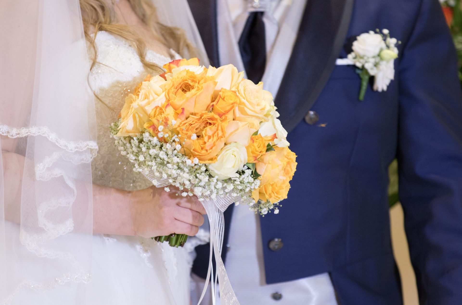
Butter yellow has become the palette most likely to divide a bridal party at first mention, and the most likely to win everyone over once it’s in the room.
Unlike a brighter lemon or mustard, it reads soft and buttery rather than bold. It’s closer to candlelight than sunshine. That’s exactly why it photographs so well against neutral linen, cream florals and warm timber furniture.
It suits spring and early autumn weddings particularly well, softening a season that can otherwise tip into either pastel sweetness or autumnal heaviness.
Paired with white or ivory gowns, it adds warmth without competing for attention, and it works surprisingly well against black-tie formalwear on groomsmen, giving it more range than its gentle appearance suggests.
Florals in the same tonal family (ranunculus, garden roses, billy buttons) extend the palette without needing a single loud accent colour.
Where it can go wrong is oversaturation: too much butter yellow across linens, flowers and bridesmaid dresses at once starts to read as simply yellow rather than the soft, buttery version couples are actually after.
Used as a dominant note against cream and warm neutrals, rather than as the only colour in the room, it holds its charm across an entire day, from morning ceremony through candlelit reception.
Powder blue
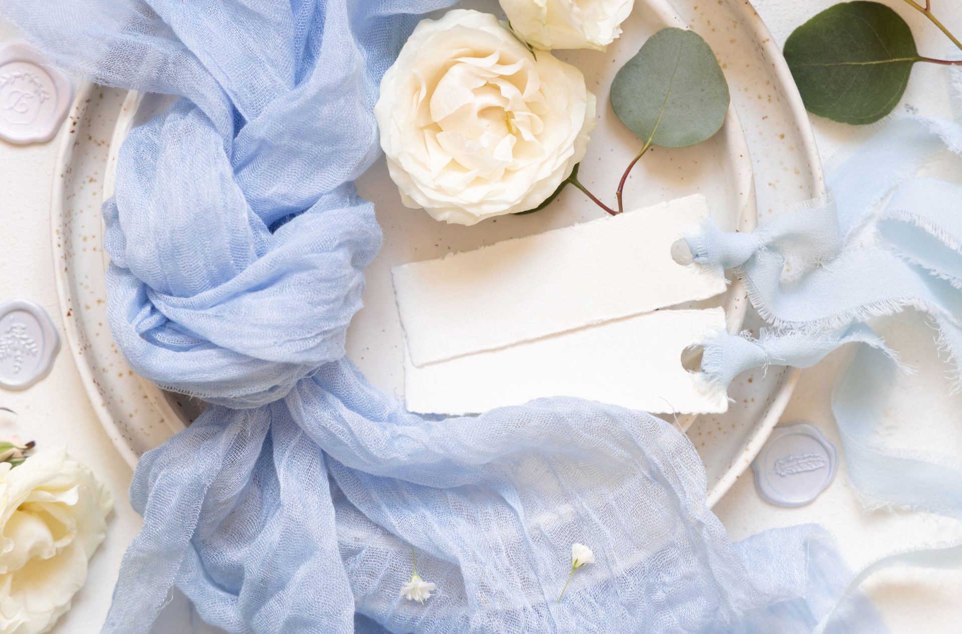
Powder blue sits at the cooler, calmer end of this year’s palettes, and has become the default choice for couples chasing an old-world romantic feel without committing to a fully vintage theme.
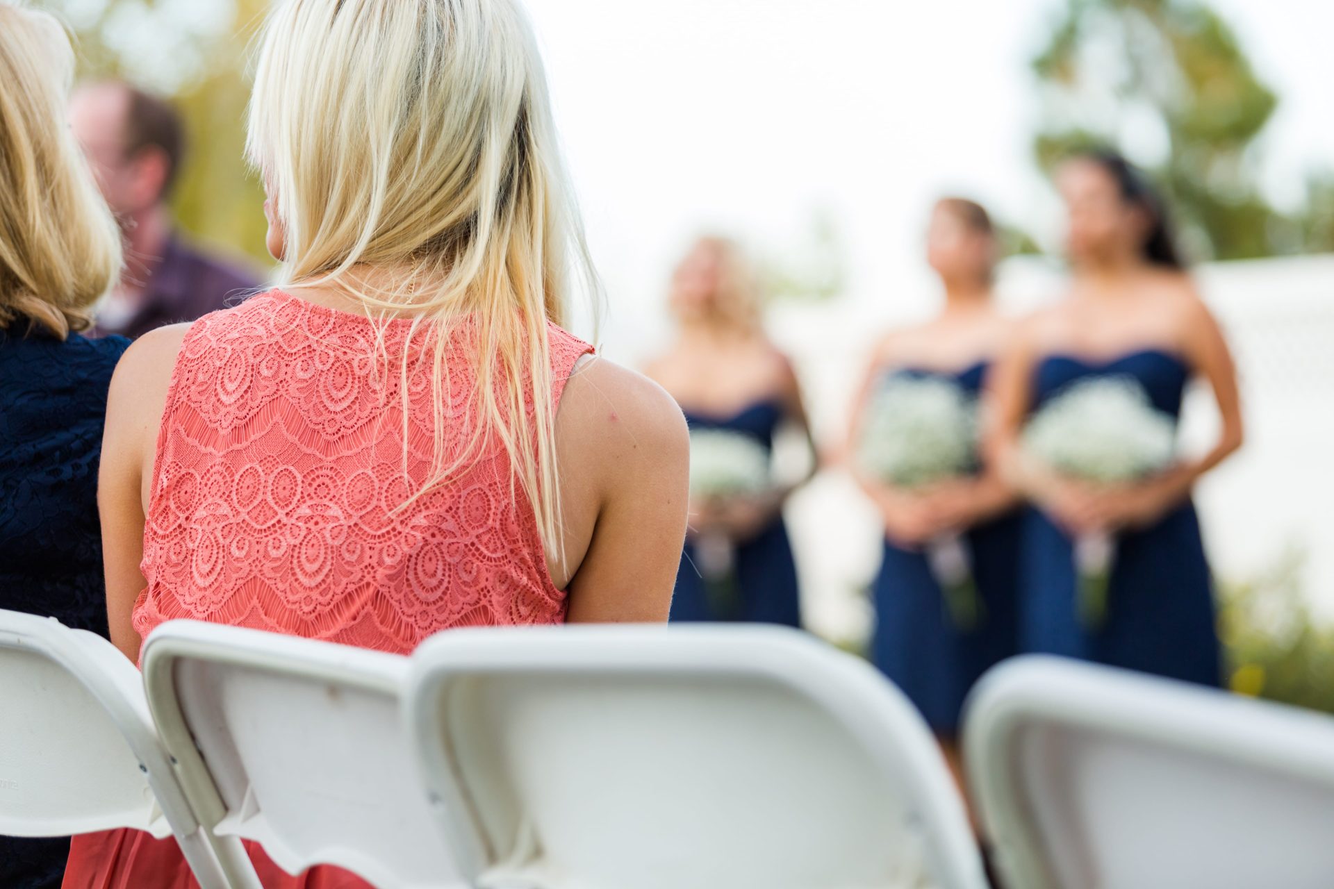
It reads beautifully across bridesmaid dresses, groomsmen ties and table linen alike, and has the useful property of photographing well in both bright outdoor light and the warmer, dimmer tones of an evening reception. That’s more than can be said for some of the deeper jewel tones that trended a few years ago.
The palette pairs naturally with silver and pearl detailing rather than gold, giving it a slightly more formal, classic edge than butter yellow’s softer, countryside feel. Delphinium, hydrangea and eucalyptus all sit comfortably within the tone without needing to be dyed or artificially matched.
It works particularly well for couples marrying in heritage venues, church settings, or anywhere with existing stone, timber or stained glass, since powder blue tends to complement rather than compete with older architectural detail.
Its main risk is coldness: paired only with white and silver, it can read as slightly clinical, so most successful versions of this palette add a single warm accent (blush, ivory or antique gold) to keep the overall feeling romantic rather than austere.
Pastel florals
Pastel florals sit somewhere between a colour palette and a styling approach, favouring layered tones over a single dominant shade.
Rather than committing to one colour, couples are drawing from a soft spectrum (dusty pink, lilac, sage and pale peach) and letting them overlap across florals, table settings and small details like drink garnishes.
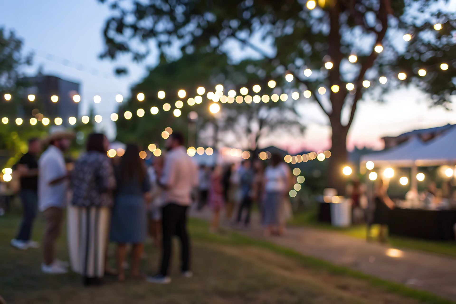
The effect is less coordinated and more composed, echoing the natural variation of a garden in bloom rather than a tightly controlled scheme. It’s particularly effective in outdoor or daytime settings, where natural light brings out the subtle differences between tones that might otherwise flatten in a darker reception space.
This palette also offers flexibility in sourcing, allowing florists to work with seasonal blooms rather than chasing exact colour matches. Garden roses, sweet peas and delphinium all sit comfortably within the mix, alongside herbs and edible flowers that can carry the look through to catering and bar styling.
Where it can fall short is in its looseness. Without a clear anchor the overall effect can feel unstructured rather than intentionally layered. That could be a dominant pastel, a consistent vessel style or repeated linen choice.
When balanced well, however, it creates a reception that feels cohesive without ever appearing overly matched.
Moody and vintage
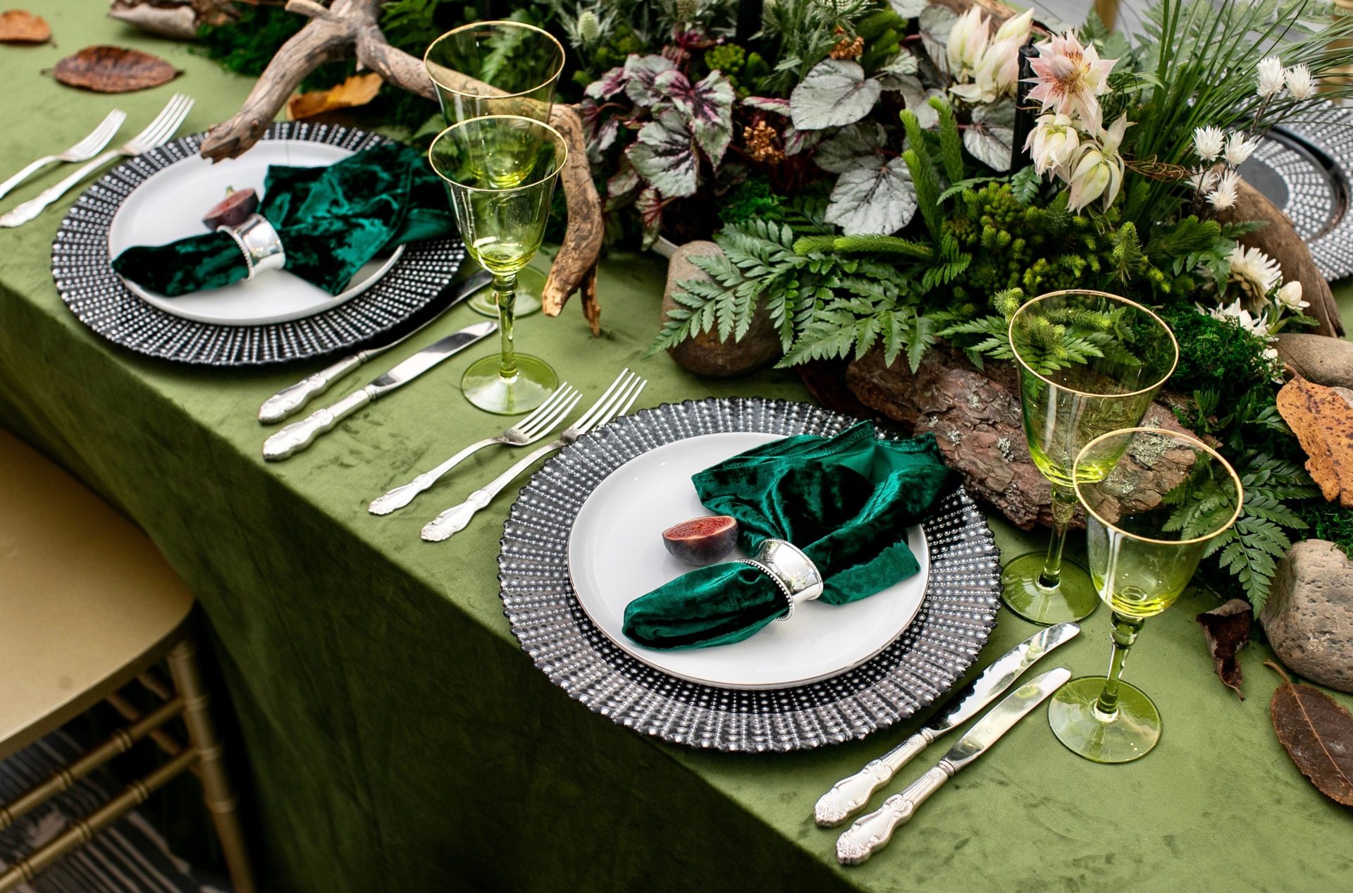
A deeper, Victorian inspired colour palette moves deliberately away from lightness, leaning into depth, contrast and atmosphere.
Burgundy, forest green, aubergine and black form the base, typically layered with antique gold rather than used sparingly, creating a sense of richness that builds across the space.
This is a palette that relies heavily on environment. Heritage venues with dark timber, high ceilings or stained glass naturally support the look, while more neutral spaces require stronger styling (velvet textures, heavy draping and candlelight) to achieve the same effect.
Florals follow suit, favouring drama over delicacy. Dark roses, dahlias and foliage with depth of colour replace softer spring blooms, and arrangements tend to be fuller and more sculptural. The result is less about freshness and more about mood, particularly as the light fades into evening.
Its main risk is inconsistency. A partially applied dark palette can feel disconnected in an otherwise bright setting, so it rewards a more complete commitment across invitations, styling and table settings. When carried through properly, it creates a wedding that feels immersive and visually distinctive from start to finish.
Earthy greens
Earthy greens remain the most adaptable of the current palettes, built around tones like sage, olive, moss and eucalyptus that work across nearly any venue or season. Their longevity comes from that flexibility, but this year’s shift lies in how they’re being paired.
Rather than the cooler whites and greys that once defined the look, couples are introducing warmer accents (butter yellow, blush and soft ivory) which soften the palette and bring a more relaxed, late-summer feel. The result sits comfortably between rustic and refined, depending on how it’s styled.
Greenery also offers practical advantages. It’s typically more accessible and cost-effective than floral-heavy designs, and holds its structure well throughout the day, making it a natural fit for DIY elements and longer receptions.
The key decision within this palette is how it’s used spatially. Sparse, minimal greenery creates a clean, modern look, while dense, layered arrangements lean romantic and abundant.
Moving between the two can dilute the overall effect, so the strongest versions of this palette commit clearly to one approach and carry it consistently across the venue.
Choosing a palette ultimately comes down to how a couple wants their wedding to feel as much as how it looks.
Whether that leans soft and romantic, structured and classic, or rich and atmospheric, the most successful schemes are those carried consistently across the day.